Color isn’t just for decoration. Our homes are backdrops for our lives, and color is one of the most powerful ways to shape how they feel. The right palette can spark creativity, make a room feel calm, or create a warm and welcoming atmosphere.
When you’re renovating, it’s easy to focus on layouts, finishes, or fixtures, but color plays a big role in how you’ll actually experience the space every day. Choosing shades that work with both the architecture and your lifestyle takes some thought, and that’s where designers can make a big difference.

Understanding Color Theory
At the center of color psychology is color theory, which gives us a framework for how colors work together. Colors don’t exist in isolation. They interact with each other and with the space they’re in. Each one has a temperature, historical associations, and an emotional pull.
Here’s how designers often think about it:
- Warm hues like red, orange, and yellow bring energy and stimulation. They work well in kitchens, dining rooms, or other gathering spaces.
- Cool tones like blue, green, and purple are calming and restorative. They’re great for bedrooms, bathrooms, or offices.
- Bright colors improve light and visibility, which can also make a space feel open and more accessible.
- Dark colors add depth and ground a space. They can feel sophisticated, moody, or cozy depending on the setting.
It’s also important to remember that colors can shift not just in depth but in temperature. For example, a green with yellow undertones feels warmer and more energetic, while a green with blue undertones leans cooler and more calming. Similarly, a highly saturated hue will feel bold and lively, whereas a muted version of the same color creates a softer, more subdued atmosphere. These subtleties can completely transform how a room feels once the paint is on the walls.
Colors and Their Psychological Effects
Every color carries its own mood. Here are some of the most common associations in interior design:
- Red: Bold and attention-grabbing. Red brings warmth and energy, and sparks conversation in social spaces. When used in the right proportions, it can make a big statement.
- Blue: Calm and steady. Blue creates a sense of peace and tranquility, perfect for bedrooms, home offices, or reading nooks.
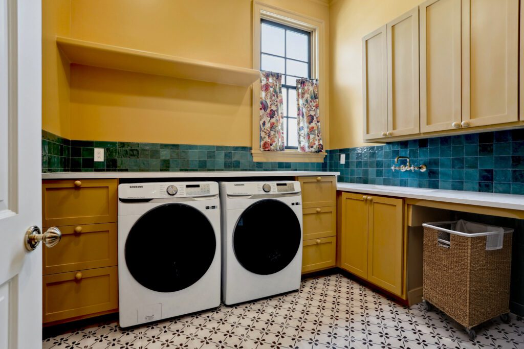
- Yellow: Bright and cheerful. Yellow evokes feelings of joy, energy, and optimism. Too much bright yellow can be overstimulating, so sometimes best in smaller doses.
- Green: Fresh and natural. Green brings balance and harmony, a conveys a connection to nature, making it ideal for living rooms or spaces where you want to relax, focus, and feel a sense of balance.
- Purple: Creative and luxurious. Purple has long been linked to imagination and sophistication, and it works well in bedrooms, creative spaces, or anywhere you want a touch of drama.
- Orange: Energizing and playful. Orange makes a space feel lively and social, perfect if you need stimulation or motivation such as an office, workout area, or game room.
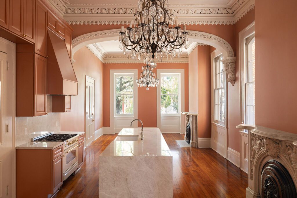
- Brown: Warm and grounding. Brown adds stability, comfort, and richness to a room, creating a cozy, timeless feel that works well in living rooms, bedrooms, or libraries.
- Black: Sophisticated and dramatic. Black can make a strong statement when used thoughtfully, whether in cabinetry, trim, or accent walls. It adds depth and contrast but should be used strategically to keep a room from feeling too dark and heavy.
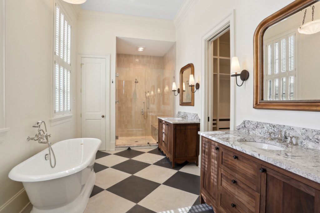
- White: Clean and versatile. White is a staple in home design, but it’s far from “one-size-fits-all.” It serves as a versatile backdrop for any color scheme and creates a timeless, airy feel.
But these colors don’t just work on their own, they interact with one another. Complimentary colors (like blue and orange, or red and green) create bold contrasts that add energy to a space. Analogous colors (those that sit next to each other on the color wheel, such as blues and greens) feel more harmonious and soothing.
The Power of Neutrals
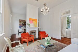
Neutrals may seem understated, but they’re often the backbone of a successful color scheme. In historic New Orleans homes, whites, creams, and soft muted tones can highlight architectural details like crown moldings, plasterwork, or detailed trimwork. A carefully chosen neutral lets those features take center stage while keeping the overall look cohesive.
It’s worth noting that even though it seems simple, even white can be one of the trickiest colors to get right. Because there’s no such thing as a true white. Every white has undertones that lean warm or cool, and natural light plays a huge role in how those undertones read. The direction your house faces, the time of day, and even your landscaping can change how a white wall looks.
When used thoughtfully, neutrals don’t fade into the background, they provide the perfect canvas for historic details while also giving you the flexibility to layer in accent colors, furnishings, and art as your style evolves.
How Color Shapes Space
Color doesn’t just influence mood, it has the power to change how we physically experience a room. The right palette can shift proportions, draw attention to architectural details, and even guide the way we move through a home. Whether you’re aiming to make a cozy space feel larger or want to create a sense of drama and intimacy, the colors you choose play an essential role in shaping the atmosphere.
For example:
- Lighter hues can open up a smaller space, making it feel open and airy.
- Darker tones can add intimacy or create drama. Color drenching, where walls, trim, and ceilings are painted in a single hue, creates depth and cohesiveness within separate spaces of a home.
- Pairing colors thoughtfully, whether complementary for contrast or analogous for harmony, can make a design feel intentional and balanced.
When chosen with care, color isn’t just about paint. It’s a tool for redefining space, highlighting a home’s best features, and connecting its character room by room.
Bringing It All Together
Color is one of the most powerful design tools we have. It can shape how a space feels and shift the mood of everyday life. Whether you’re drawn to timeless neutrals or bold, personality-filled hues, the right colors can elevate your home and make it truly yours.
If you’re planning a renovation, think about how your color palette will work with both the architectural details of your historic home, and your lifestyle. And if you’re not sure where to start, our team is here to help guide you toward a palette that feels both personal and timeless.